| Reviews & Columns |
|
Reviews DVD TV on DVD Blu-ray 4K UHD International DVDs In Theaters Reviews by Studio Video Games Features Collector Series DVDs Easter Egg Database Interviews DVD Talk Radio Feature Articles Columns Anime Talk DVD Savant Horror DVDs The M.O.D. Squad Art House HD Talk Silent DVD
|
DVD Talk Forum |
|
|
| Resources |
|
DVD Price Search Customer Service #'s RCE Info Links |
|
Columns
|
|
|
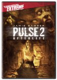
Pulse 2
The Weinstein Company // R // September 30, 2008
List Price: $19.98 [Buy now and save at Amazon]
The horror genre has done its best to make people literally afraid of everything. If you had some real emotional issues, you'd probably find yourself avoiding showers, trees, hardware, water, toys, and hell, probably even people in general. So of course the height of the age of technology brings the new horror campaign that promises to keep you scared of everything from your laptop, to a blue-tooth headset. Pulse took that idea and expanded it to be a paranormal phenomenon that was taking over the world. Think Day of the Dead, but with a virus that turns everyone into ghosts that look like static images of their former selves. Pulse2 is the direct to DVD sequel, and it unsurprisingly somehow misses the opportunity to continue the story that set the stage for the world's destruction in ghoulishly epic proportions.
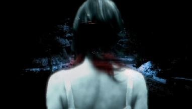
Taking place not too long after the events of the first Pulse, the world has become an empty place. People are committing suicide as an easy out, others confine themselves to a red permeated tomb, and some are adapting and learning how to keep themselves safe by wearing red outfits.
Instead of telling you right off the bat what to expect in this film, I want to do something a little different. I'd like to tell you what even a schmuck like me could have figured out, as to what should have been the natural progression in the story.
Since the first film focused on telling us how this all began, the next most logical step is to focus on the meltdown of the world. There's a story that's been set up to show the audience an apocalypse that was brought on by the digital age. I know it's not the most original idea in the world, but just thinking about some of the haunting imagery that could have been done gives me the chills. With the right director, even one who was willing to earn a low wage and work on a low budget, the atmosphere could have been the creepiest we've seen in years.
I know it sounds like my expectations were set pretty high, but they weren't. I just think the natural progression was sort of an easy one to figure out, unfortunately the story we're given doesn't complement this idea very well at all.
Stephen had separated from his wife, Michelle, because he grew tired of the relationship and moved on with another woman. Their daughter Justine is caught in a boiling pot of trouble that she's not aware of just yet. Her parents are separating around the same time the world is fading away, and this puts her life in mortal danger. Justine runs away, and each parent is following their own story arc to find their daughter for very different reasons.
The plot tries to play some tricks on the audience, surely as a way to make us drop our jaws and say 'woah, no way, I totally didn't expect that'! Those attempts to pull the rug out from under us fail miserably. Another thing I found pretty distracting, was the fact that Pulse 2 was 'borrowing' some material from other horror films to the point where it was distractingly obvious. Well, at least to me. One of the tricks that gets played on the audience at about the twenty five minute mark, mimics the 'character focus change-up' trick from Psycho. At one point we hear the creepy piano 'stalking' music from Halloween, and I'm sure you can imagine how much that must have stuck out.
Because the plot is always trying to stay fresh for the audience by changing things up, the end result is a film that feels like it's all over the place. It never really knows what its central focus is until the end, so we're left with a movie that has some incredibly jumpy pacing. To be honest, I think they knew the movie was a mess, because they tried to spruce it up with some gratuitous gore and nudity. I'm down for gore and some bare boobage, but not when it's blatantly obvious they're in the film just for the sake of trying to keep me hooked!
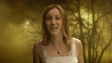
Besides the lack of focus and the grand theft of classic cinema we have going on, nothing was more distracting to me than the backgrounds. Eighty percent of this film, and that may even be an understatement, looked to have been filmed in front of a green screen. Even simple interior and exterior shots that take place in a cabin, or on a street, all seem to be green screen backgrounds. Why they didn't just film certain scenes outside, or inside of a cabin, really leaves me scratching my head. I'm not against using a green screen for backgrounds if it can look natural, but the lighting on the actors and actresses draws attention to the fact they're in a studio in almost every scene. Have you ever played that old live action PC game Phantasmagoria? Yeah? Well, it was pretty similar to watching a live action film like that.
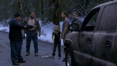
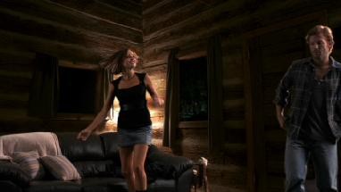
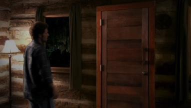
Every horror movie to a certain degree, makes the viewer ask 'why did they do this when they should have done that'? However, Pulse 2 has me asking this again, and again, and again. There are certain points in the movie when I wanted to reach inside my television, and slap a character or two around a little. For example, Justine and her father meet a guy who's covered from head to toe in red, and this guy explains to them that red is the only frequency these ghosts can't penetrate. Do you think Steve decides to rush to the local clothing store that's been abandoned and grab any attire at all that's splashed in red? Of course not! That would have made too much sense!
You could certainly do a lot worse than Pulse 2, but this one still has 'stinker' written all over it. Poor pacing, 'Colorforms' green screen effects, and some bad acting from the supporting cast, all play a hand in making this film fall apart. It's too bad the company behind this film had already committed to making Pulse 3!
The video is actually pretty solid for a direct to DVD production. Black levels remain consistently solid, helping to create a very nice contrast in some of the brighter scenes in the film. Whites look very nice and only bloom when the directed intent was meant to do so.
The color palette is intentionally muted most of the time, but certain colors are allowed to saturate to an impressive degree from time to time. There's very little grain to speak of at all, and the image is sharp. Macro blocking is almost non-existent, even in scenes that are heavy with fog.
The only real complaint I have about this transfer, is that there's some ugly edge enhancement that's noticable once in a while. Some of this may be a bi-product of having a low budget, and filming a majority of the movie on a green screen. All in all though, this is a surprisingly good transfer.
The Dolby Digital 5.1 track, much like the video, surprised me with its performance. This track can get very loud without presenting any clipping or distortion. The bass was surprisingly deep and full for a home video release as well. The intense volume and room shaking bass are effective at conveying the feeling of dread.
There are some issues though. Although the sound transfer seems to represent the director's intention without any issues, there were some problems with the mix itself. The louder scenes have a tendency to drown out dialogue, and the bass isn't just loud, it's excessive.
There's a fine balance that can be achieved when mixing a horror film so the dialogue always remains audible, no matter how quiet or loud a scene gets. Pulse 2 is a little overzealous in trying to obtain a nice dynamic range, and anyone who's not in a situation where they can play a film as loud as they want, are going to have a cramp in their thumb from adjusting the volume so much. I hope Pulse 3 finds a better way to achieve a soundtrack that's loud and filling, without sacrificing the ability to hear everything that's being said clearly.
Subtitles are available in Spanish, and English.
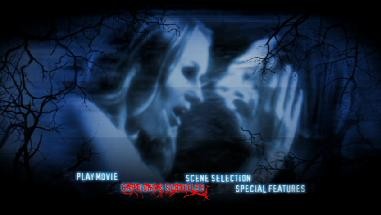
Commentary with Writer/Director Joel Soisson, Producer Michael Leahy, Co-Producer Christian Agypt, Line Producer Ron Vecchiarelli, Editor Kirk Morri, Makeup Effects Supervisor Gary J. Tunnicliffe, and Visual Effects Supervisor Kevin O'Neill - Since I've commented on the terrible use of green screen in this film, I wasn't surprised to hear this brought up in the commentary track at all. When presenting the idea of Pulse 2 to Bob Weinstein, they were pitching the idea they could do a green screen movie like300 or Sin City, but at a very affordable price. They could use backgrounds that looked convincing enough, and it would save a lot of money and be a saving grace for small budget directors in the future.
The thing they didn't think about however, was the fact that 300 and Sin City had to money to make everything on the screen gel together. Pulse 2 made this look very sloppy.
The commentary track is a good listen. Everyone involved chimes in to explain why certain things were done the way they were done in this movie. There's no dead air, and nobody is monotone or boring. So many people are on the commentary track for such a bad movie, that it makes me wish more mainstream films put this much effort into it.
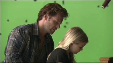
Deleted Scenes - There are only two deleted scenes. The first one was a very forced attempt to try to catch the audience up to speed with what's going on, and the second is a sappy scene between Stephen and his daughter. It's easy to see why they were kept out of the film.
I thought it was pretty funny that they presented the second scene with a warning that said it was a 'work in progress', and may have been missing some special effects. Some special effects? The entire background was absent! What we get, is a scene that was filmed in front of a green screen.
A Sneak Peak at Pulse 3 - This is pretty much a short teaser trailer, and it really doesn't look that bad. There's some good cinematography that looks genuinely creepy, but I could have spliced something that look great by using footage from this movie, so we'll have to see how that plays out. I think the third film could have some potential, but I'm not going to hold my breath.
Overall, the commentary is the only worthwhile thing on this release as far as extras go. The other features are minimal at best.
A great idea for a story was practically gift wrapped for this movie, but instead it focuses on a broken marriage. Pulse sets up a decent story that should have inspired a wealth of ideas, and somehow they got it wrong. Not only did they get it wrong, but they felt it was necessary to 'borrow' material from other infamous horror films. Acting from much of the supporting cast was horrendous, and the pacing was erratic because this film never knew which direction it wanted to go in. It doesn't help that this movie was distractingly fake due to some terrible green screen work.
Pulse 2 isn't the worst direct to DVD horror film I've seen by far, but it still doesn't mean it's worthy enough for a positive recommendation. Fans of the first film are undoubtedly going to find themselves compelled to seeing this anyway, as well as those who absolutely must see every horror movie that comes out. If you're one of those people, I would strongly advise against a blind buy. Make sure you rent this one before you consider blowing more money on it than you have to.
-About the Author- Michael Zupan is primarily a film guy, but has a variety of places where you can enjoy his work otherwise. Check Bytesizeimpressions.com for video game op-ed pieces and podcasts, and be sure to check out the sister site, Byte-Size Cinema, linked up top. This writer also contributes significantly to in-print magazines such as Minecraft Explorer and Fortnite Explorer!
|
| Popular Reviews |
| Sponsored Links |
|
|
| Sponsored Links |
|
|
| Release List | Reviews | Shop | Newsletter | Forum | DVD Giveaways | Blu-Ray | Advertise |
|
Copyright 2024 DVDTalk.com All Rights Reserved. Legal Info, Privacy Policy, Terms of Use,
Manage Preferences,
Your Privacy Choices | |||||||


